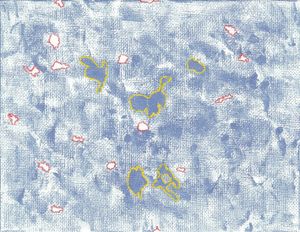
Art:Blueness, 2009
From Robupixipedia
Jump to navigationJump to search
With a carefully balanced blue, I noticed some white space that needed accentuation. I chose red, thinking it would stand out most effectively. Then I figured the all-blue areas should get equal treatment. I chose yellow because I wanted to stick with primary colors. Green would have been the opposite of red, but I thought all primary colors would be better in the end.
This piece was purchased by Canadian Mike from my second art show (at ELF in Tachikawa).
The permalink for this page is https://art.robnugen.com/blueness
