Art:Blueness, 2009: Difference between revisions
From Robupixipedia
Jump to navigationJump to search
m (categories) |
m (<permalink>) |
||
| Line 5: | Line 5: | ||
This piece was purchased by [[peeps:Canadian Mike|Canadian Mike]] from my second art show (at [[places:ELF|ELF in Tachikawa]]). | This piece was purchased by [[peeps:Canadian Mike|Canadian Mike]] from my second art show (at [[places:ELF|ELF in Tachikawa]]). | ||
<permalink> | |||
[[category:art]] | [[category:art]] | ||
[[category:marker]] | [[category:marker]] | ||
[[category:canvasboard]] | [[category:canvasboard]] | ||
Revision as of 20:26, 12 February 2011
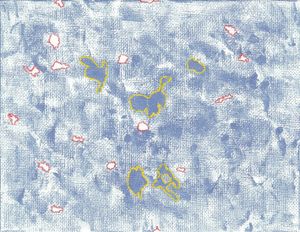
With a carefully balanced blue, I noticed some white space that needed accentuation. I chose red, thinking it would stand out most effectively. Then I figured the all-blue areas should get equal treatment. I chose yellow because I wanted to stick with primary colors. Green would have been the opposite of red, but I thought all primary colors would be better in the end.
This piece was purchased by Canadian Mike from my second art show (at ELF in Tachikawa).
<permalink>
